Sunday, April 18, 2010


Name of Ad: Keurig Print Ad

Client: Keurig

Target Audience: Busy Adults

Single sentence (Single Most Important Point): Keurig tastes great and can be made in under 60 seconds.

Art direction intent, if not clear: People go out to buy coffee because when they make it themselves it just doesn't taste as good. Sometimes it tastes like it was brewed in the toilet. This is supposed to be a picture of a toilet bowl filled with coffee. Keurig fixes the problem of homemade coffee that tastes like crap.


Name of Ad: Gold Bond print ad

Client: Gold Bond

Target Audience: Young people with itchy burning feet

Single sentence (Single Most Important Point): Gold Bond can take care of itchy burning feet and therefore make all sorts of situations more comfortable.

Art direction intent, if not clear: A list of very awkward situations that are referred to as "insert foot into mouth" moments. A clear product shot in the bottom right next to copy suggesting that if you have to put your foot in your mouth at least Gold Bond will make sure it is a clean, dry foot.


Name of Ad: Hamburger Helper Print Ad

Client: Hamburger Helper

Target Audience: Busy Moms

Single sentence (Single Most Important Point): Hamburger Helper is a great solution for Mom's who have to prepare dinner every night.

Art direction intent, if not clear: Simple and clean direction as the words do most of the talking. Good news for moms, bad news for cows.
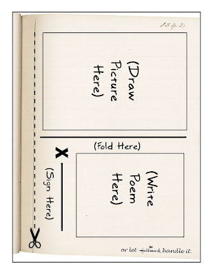


Name of Ad: Hallmark magazine Ad

Client: Hallmark

Target Audience: Dudes looking for the right words to say

Single sentence (Single Most Important Point): Hallmark says things better than you can say them yourself.

Art direction intent, if not clear: This is intended to be a magazine ad. The page has directions written on it for how to cut it out and make a homemade card. There are lots of directions and it looks kind of complicated. The copy at the bottom suggests that Hallmark can make this job much easier.


Name of Ad: Billboard

Client: Burt's Bees Lip Balm

Target Audience: Teenage girls

Single sentence (Single Most Important Point):If you use Burt's Bees your lips will be so soft people will want to kiss you all the time.

Art direction intent, if not clear: BIg photo of a beautiful smiling young woman on the right, copy in the colors of the brand on the left. "Slather. Smooch. Repeat." Simple, cute, instructions for product use.


Name of Ad: Long Copy Ad

Client: Pike Place FIsh Market

Target Audience: People who have never been to Seattle, WA.

Single sentence (Single Most Important Point):Pike Place Fish market is world famous.

Art direction intent, if not clear: The most exciting thing about Pike Place Fish Market is that the employees who work there throw the fish to each other and make a big show out of it. I want the pictures of the ad to look like they are tossing the fish from the bottom left of the page to the top right.

Sunday, April 4, 2010

http://www.youtube.com/watch?v=3quMz-EAThw

This ad for Corn Nuts only ran for a short period of time- after you listen to it you will know why. It is controversial and has a call to action for consumers to "bust a nut" in multiple random public places. I think it hits the younger, edgy target demo for Corn Nuts though. Pretty catchy too. It ran as both a radio spot and a TV commercial in the 90s, I think that it has more of an impact without the video.

Sunday, March 28, 2010


Travel and tourism. Usually what comes to mind when one thinks of advertising thats going to entice people to spend loads of cash to get away from their hectic lives are images of serene beaches with white sand, sunny skies, and clear blue water. Or maybe night clubs with beautiful people and flashing lights. Or images of historic monuments and famous locations. When people advertise places for you to come visit, they list reasons about why their location is so great. It the hottest, most famous, has the best food, its family friendly, etc. The lists go on and on. I liked these ads because they don't highlight the things that you are running to, but rather the things that anyone who needs a vacation might be running from; annoying relationship issues, annoying family members, or just annoying strangers. The way the ads are written are hilarious too. Its remarkable to connect a Jehova's Witness to a vacation add but this person definitely pulled it off. The ads also don't highlight anywhere specific that the person should go, just the means for how they might get there- the motor home. Though the images and the lay out aren't especially eye catching, the copy is engaging and thats why I like them.

Sunday, March 7, 2010


First ad caught my eye because it reminds me of the linoleum "whack". What does linoleum have to do with anything? Nothing, really. What do hot chicks in bikinis have to do with batteries? Nothing, until I read the copy. They still really don't have much to do with batteries but it was a fun read regardless.

The second one I like because it is written on a banana- which again has nothing to do with Honda or Newspapers- but was clever none the less. It reminded me of a time when my friends and I drew all over a watermelon. People really don't write on fruit enough. Its funny and gets peoples attention no matter what you draw or write. People will stop and look at food thats drawn on.

I like the style that the last one is written in. I like the little pictures that are inserted; they definitely add to the style of the piece and hectic tone of the copy. I did read the whole thing and enjoyed it, which is pretty powerful because I am most certainly not in the target market for the ad.

Friday, February 26, 2010


This first bench is a clever ad for KitKat, most commercials show the candy bar half unwrapped so that you can see the individual pieces of candy, but also that you can still make out the coloring and the logo on the wrapping. The individual slabs of the bench show the different segments of the candy bar, which makes the brand easily recognizable no matter which portion of the bench is being sat on. Someone could even cover up the logo and leave the remaining red wrapper showing and the slabs of candy and most people walking by would recognize it as a kitkat ad.

The second ad is meant to inspire the local people of Istanbul to read more. Many benches like this are placed around the city. They look like open books and each bench carries poems from a Turkish poet. Its a clever idea because people who sit on benches are obviously sitting there because either they're tired of walking, or they are waiting for something or someone. This means they have plenty of time to read what is writing right next to them- they inspire reading exactly what the ads were meant for.

Heisse Tesse, an Erasco brand meaning "hot cup" sells warm soups. This ad is perfect for showing that. Soup sales definitely increase in the winter because people enjoy soup more when it is snowing outside- the ad shows that the soup warms people up so much their bodies can melt the snow right off of the bench.

Sunday, February 21, 2010


This is a great ad campaign for CLUE. It takes the central theme of the game- catching a murder suspect- and puts the target audience right in the center of the game. They don't even have to do anything out of the ordinary in order to participate in the ad, just wash their hands. The blood red coloring of the soap makes the consumer feel like they are washing blood off of their hands. Its edgy and provocative, the tag line "everyone is a suspect" exaggerates the suspicious feeling of everyone that players have during the game, and turns it around. Now people feel as though they have reason to have other people be suspicious of them.

Sunday, February 14, 2010


The first one is my favorite of the three. Communicate Clearly for vodafone. I think its really clever. The red is the same red in the logo for the company. But I think ads with verbal solutions are usually going to have a lot of red in them to get the attention of their target audience because they don't have an intriguing image to grab attention immediately.

The last two are ads from the same campaign- Dagens Industri a newspaper in Sweden. The advertisements are urging people to advertise in their newspaper during the time of recession. They state that if you advertise when no one else is you will gain market share. I like the "peep" one more than the "recession at last!" one because I think it communicates more clearly the fact that no one else is advertising because of all the empty space.

Thursday, February 4, 2010

VISUAL SOLUTIONS


My least favorite of the ones I picked today so i'll do it first. Though its clever to warn against dropping knives not because it is dangerous for yourself but because the knife will go through the floor and become dangerous for your neighbors, the message of the image isn't instantly clear. This is because the knife is so small and the coloring is very pale, it takes a while to even find the knife. Also, though the look on the woman's face is funny, she doesn't seem to be in any immediate danger. I would have put the knife closer to her head and made the whole scene a little smaller and more zoomed in. Still clever though.


Ads with Visual Solutions. I had never heard of ansell before, maybe that's because I have never worn rubber gloves to do the dishes before. Nor do I care about rubber gloves. Or doing the dishes for that matter. But if I were washing precious china I would want to make sure I didn't drop it. These ads communicate the no-slip guarantee through visuals of extra handles and grips that have been added to the flatware and other dishes due to the glove that is holding it. Pretty well executed I thought, though I like the one with the mug the least.


The tag line is almost unnecessary. We all know what bad snoring sounds like, and can feel like, when you're trying to get a good nights sleep. I can sometimes hear my dad from two stories away.

Sunday, January 31, 2010

http://adsoftheworld.com/media/tv/film_festival_of_eastern_europe_stories_2

Unexpected Comedy. A story line is built around the sad story of a man who lost the woman he loved for many years. She has since developed a disease that is deteriorating her memory. An exact replica of the story of "The Notebook" by Nicholas Sparks you can tell that they used to be madly in love but now she can't remember her... blah blah blah. You think you know where the story is going until she whips out a light saber to kill a fly. Hilarity. The ad is for the Film FEstival of Eastern Europe, the copy reads: Stories that don't need lighsabers.


Literal Advertising. This product pics up cat hair. Good idea, ok excecution. Would have been better if the cat were less cheesy looking, it reminds me of halloween. This lint rollers have nothing to do with halloween.


Sorry. It's disturbing I know but I thought if any ad hit the nail on the head for achieving the "shock" factor, this was it. Breath mints that make you think about a butt? Gross. Effective at getting the point across that the mint can cure even the worst breath, not something I would want to use for my product though. Disturbing.

Wednesday, January 27, 2010

THIS IS MY NEWWWWWW BLOG